THE BAKERRY CONFECTIONS
LOGO + BRANDING
BUSINESS WEBSITE + DIGITAL CONTENT
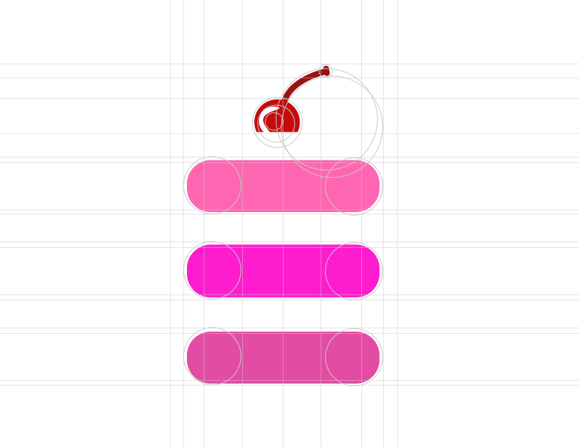
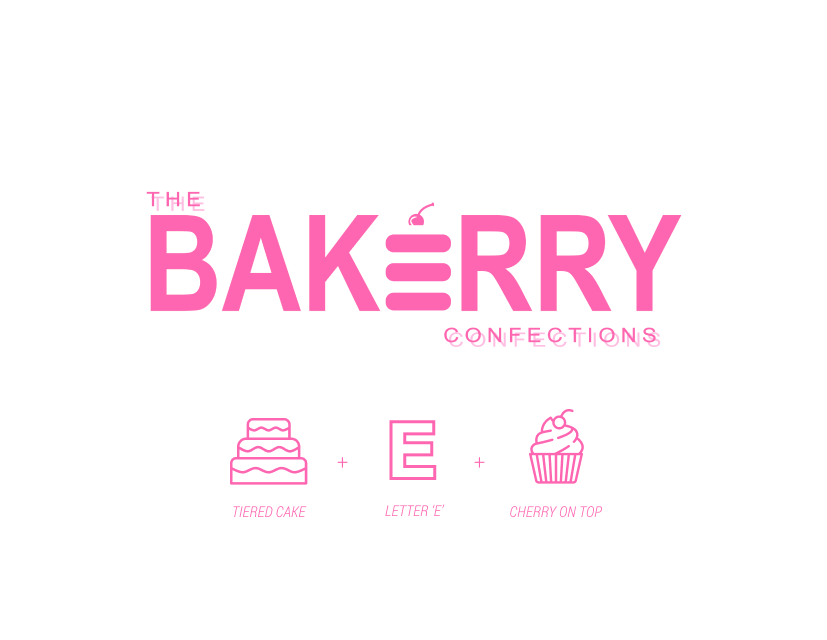
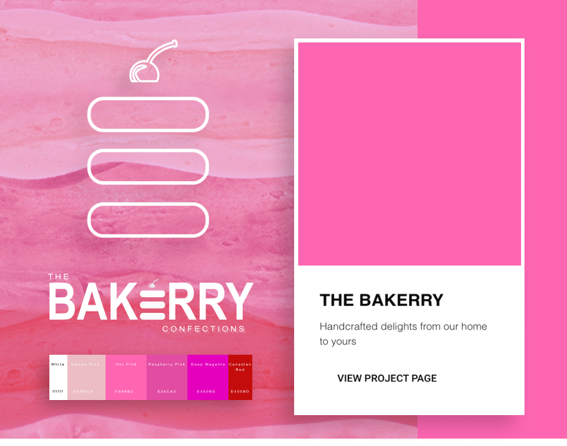
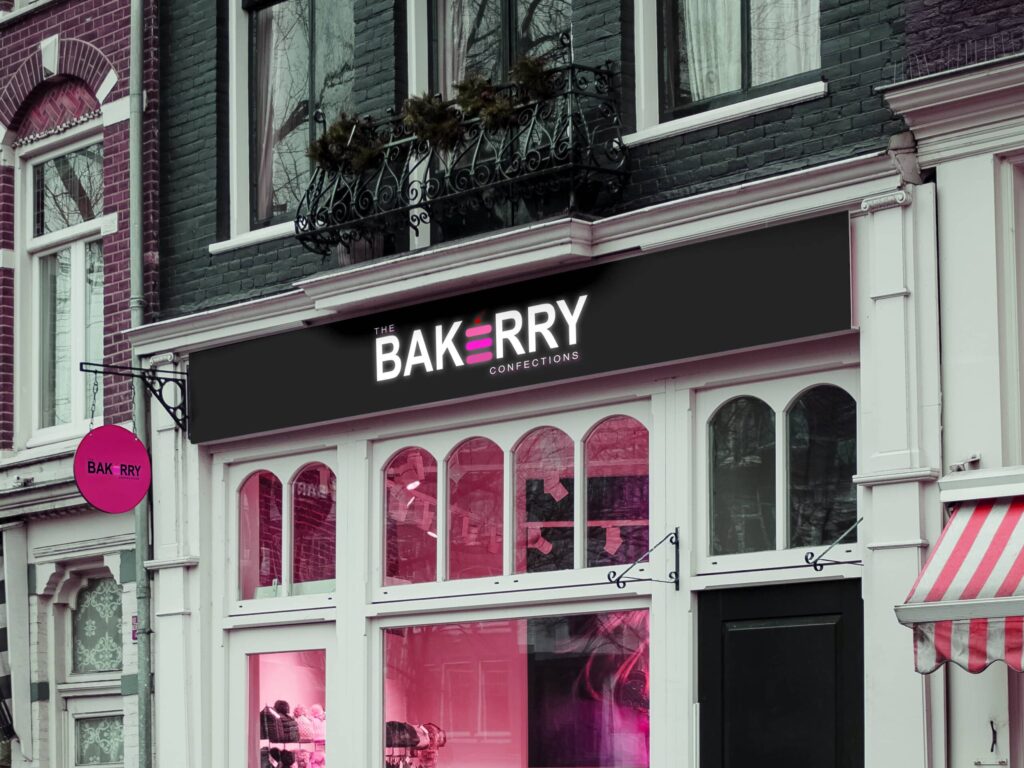
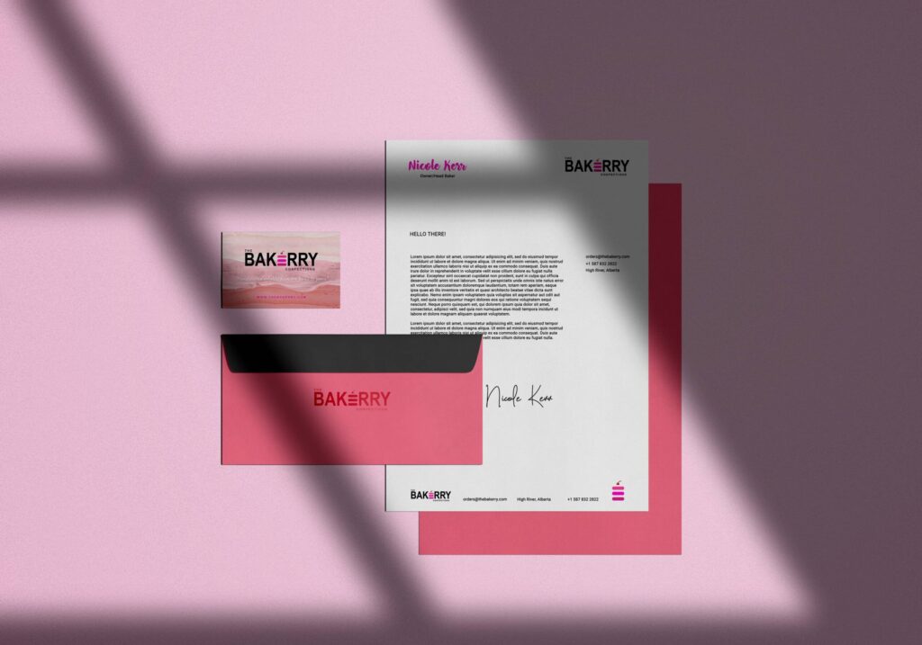
The logotype contains a unique iconic mark that takes the silhouette of a three-tiered cake and the letter “E” that reflects the chosen color palette to symbolize the owner’s children. A modern wordmark bearing the name of the bakeshop accompanied the logo using a sans serif typography that’s minimalistic yet easily legible and responsive in various sizes across digital and printed materials. Complimenting the logo is a tagline especially ideated for the brand that reflects its humble beginnings and conveys the stories it wants to tell — bringing handcrafted delights from the heart of their home to their customers’.
RESPONSIVE + INTERACTIVE
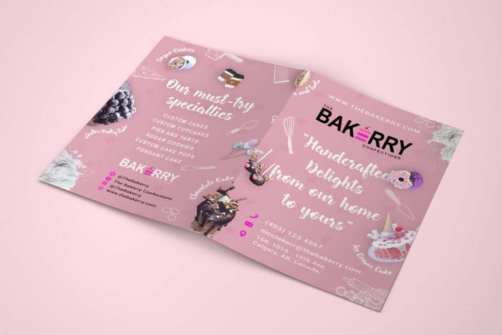
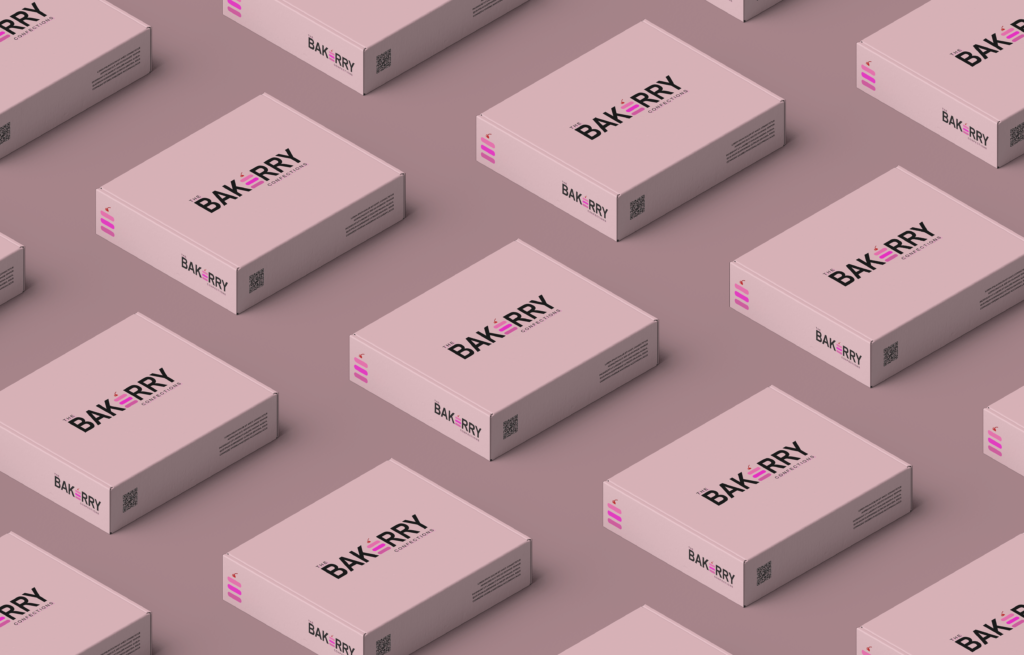
Official branding materials were produced for The Bakerry bearing its logo and channeling the aesthetic of the brand. Business cards, product brochures, and packaging were designed for the company featuring ambient imagery, original product images, and concise information about The Bakerry. The same modern-minimalist font was utilized in the materials paired with cursive typography accents to reflect its playfulness and professionalism at the same time.
E-COMMERCE + DIGITAL MARKETING
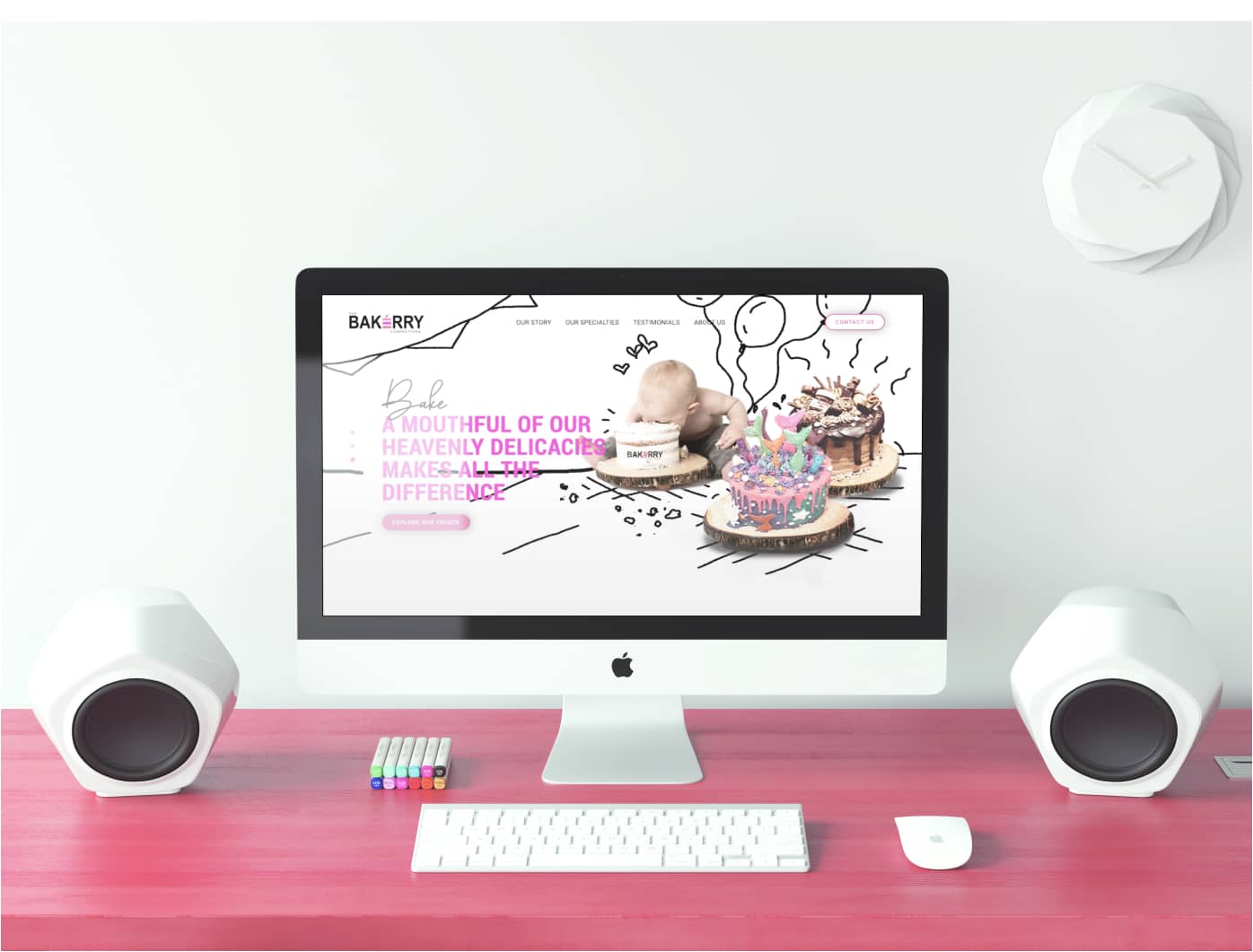
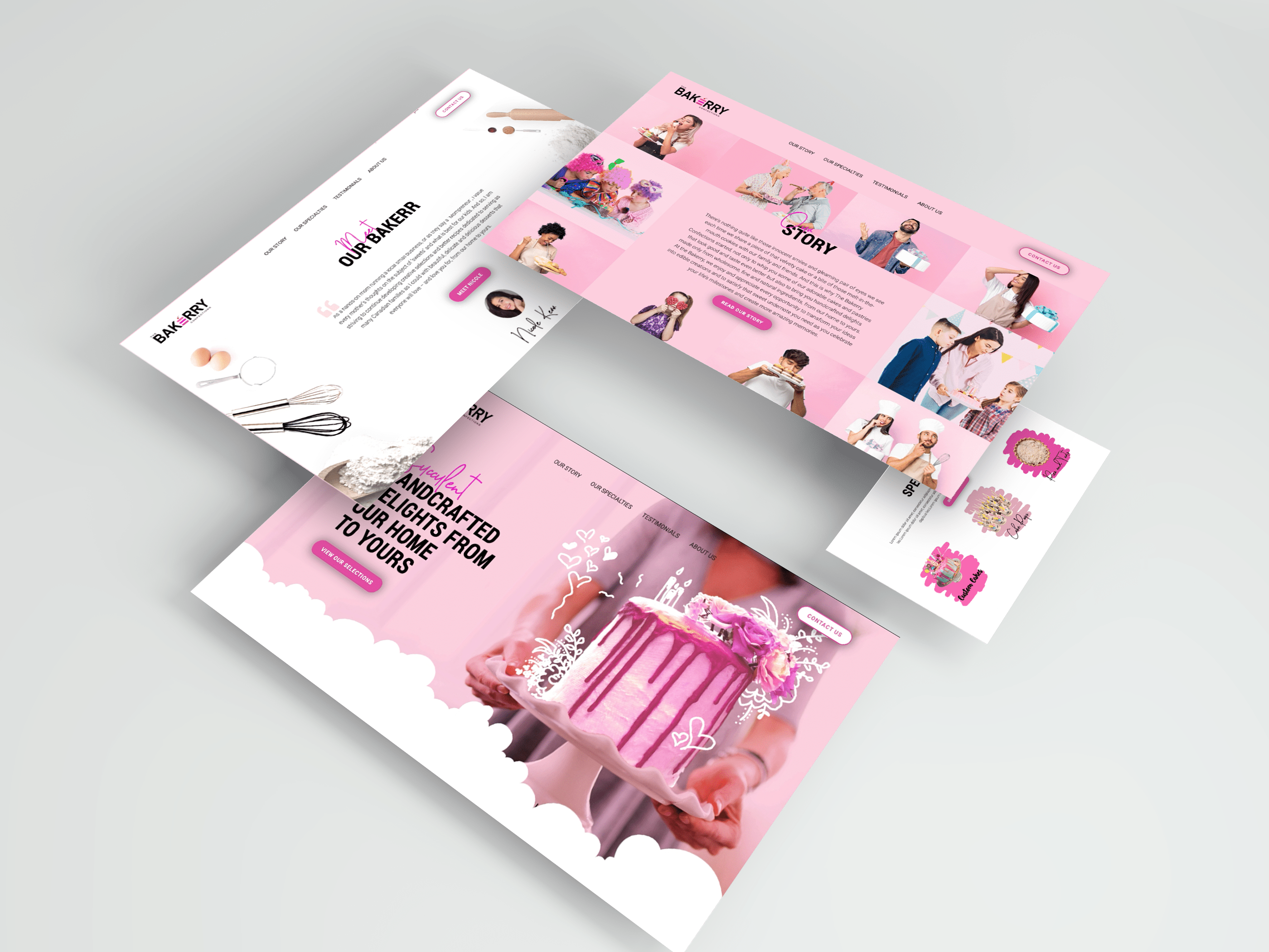
Through the forms, buttons, navigation elements, and overall layout, the website aims to bring an intuitive experience and beautiful interface without compromising functionality. Aside from the versatility in design, the website is also built to be responsive across different device layouts to ensure accessibility for all kinds of users.
The forms provided along with the selection of products highlighted in its e-commerce section allow consumers to effortlessly order online and reach out to the business for information in ways more than one. And topping off the cohesive website are carefully written copies to further convey the message of the brand and the values it stands for together with authentic social proofs such as testimonials and reviews to deliver confidence to its buyers and patrons.

